
SCROLL TO READ
<WANDER>
TYDE AGENCY
MONDAY 01, JUNE 2026
Fratelli Bonvini Milan
<WRITER> Marc Baker
<PHOTOGRAPHY> Marc Baker

<03>
On a quiet street in southern Milan, a shop that has been trading since 1909 offers something quietly radical: the chance to slow down, pick up a pen, and remember what it feels like to make a mark by hand.
Milan does not do things quietly. The capital of the Lombardy region and the undisputed commercial engine of Italy, it is a city of perpetual motion — of fashion weeks and finance, of aperitivo crowds spilling onto cobblestones, of the kind of food that makes you reconsider everything you thought you knew about eating. It is a place where ambition and aesthetics move in lockstep, and where the design and creative industries feel not like a subculture but a civic identity. We were in the city for Packaging Premiere Milan, the international trade show dedicated to premium and luxury packaging — a gathering of the industry’s finest minds working at the intersection of craft, material and commercial creativity.
Having arrived in Milan a few days before the event, we did what you should always do in a city like Milan: we wandered. And wandering, as it so often does, led us somewhere we hadn’t expected.
FRATELLI BONVINI
Fratelli Bonvini has been here since 1909. It was founded by siblings Costante and Luigia Bonvini as a neighbourhood stationery shop serving what was then the municipality of Vigentino, later absorbed into Milan in 1923. Over the following decades it grew into a working typography: printing business cards, wedding invitations, event posters, encyclopaedia handouts, university degree theses. It was the kind of business that a neighbourhood needed and took for granted, right up until it almost ceased to exist.
THE RETURN TO THE HANDMADE
There’s something about writing by hand that no digital interface has managed to replicate. The slight resistance of nib on paper, the particular weight of a well-made pen, the way your thoughts seem to slow themselves to meet the pace of your hand — these are not romantic affectations. They are real, embodied experiences that screen-based communication has quietly eroded.
There is a growing counter-movement to this erosion. The slow movement, which began in food and has spread across creative culture, is increasingly finding expression in the resurgence of handwriting, letterpress printing, analogue photography and traditional craft. People are seeking out the friction. Not out of nostalgia, exactly, but out of a recognition that speed has a cost. Some things — thought, care, expression — are better done slowly.
The notebook has made a comeback. Fountain pen sales are rising. Workshops in bookbinding, calligraphy and letterpress are oversubscribed. There is a particular hunger, especially among younger generations who have grown up entirely on screens, for the tangible — for materials that push back, that record the evidence of human hands, that cannot be deleted with a keystroke.
Fratelli Bonvini, whether by accident or by design, is the perfect embodiment of this moment. It has simply always been this way.


<02>
<03>
THE SHOP THAT TIME PRESERVED
Just off a bustling road in the southern reaches of the city, Via Tagliamento offers nothing by way of exterior spectacle. The door to number one doesn’t announce itself. Step through it, however, and you enter somewhere else entirely.
When the last of the Bonvini line, Leila — a Milanese dialect poet — passed away along with her husband Luigi, a group of friends and typography enthusiasts stepped in. In 2014, they took over the shop and undertook a meticulous restoration, keeping every fixture, every machine, every drawer exactly as it was. The result is something that defies easy categorisation. A time capsule, yes — but emphatically not a museum. This is a daily working space.
Speed has a cost.. Some things — thought, care, expression — are better done slowly .
<06>
<05>

<04>
ROOM BY ROOM
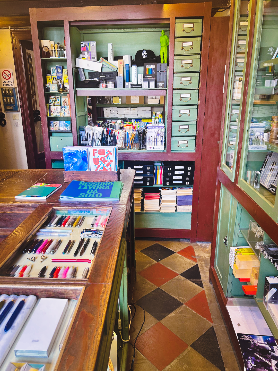
The front room is a stationer’s dream. Ink pens, calligraphy nibs, notepads, papers and writing instruments are arranged in glass-topped counters and on original wooden shelving with the kind of quiet authority that only comes from a century of knowing what belongs where. The tiled floors — a diamond pattern in terracotta, green and cream — are original. The fittings have the dark, worn permanence of things that have earned their place.
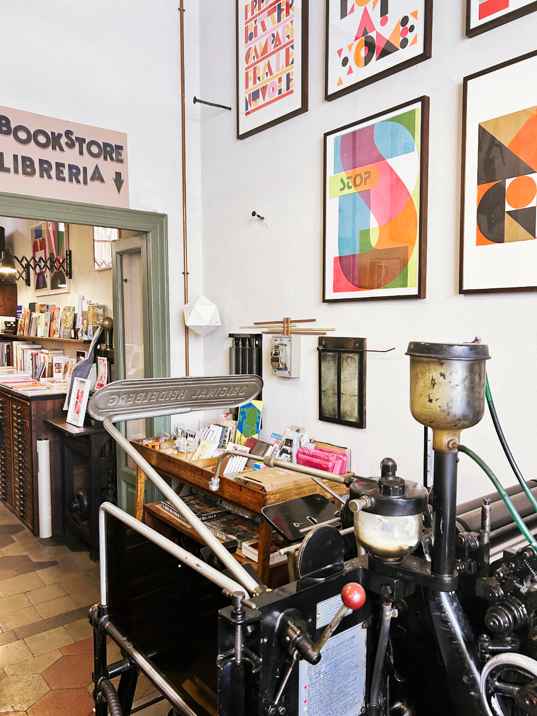
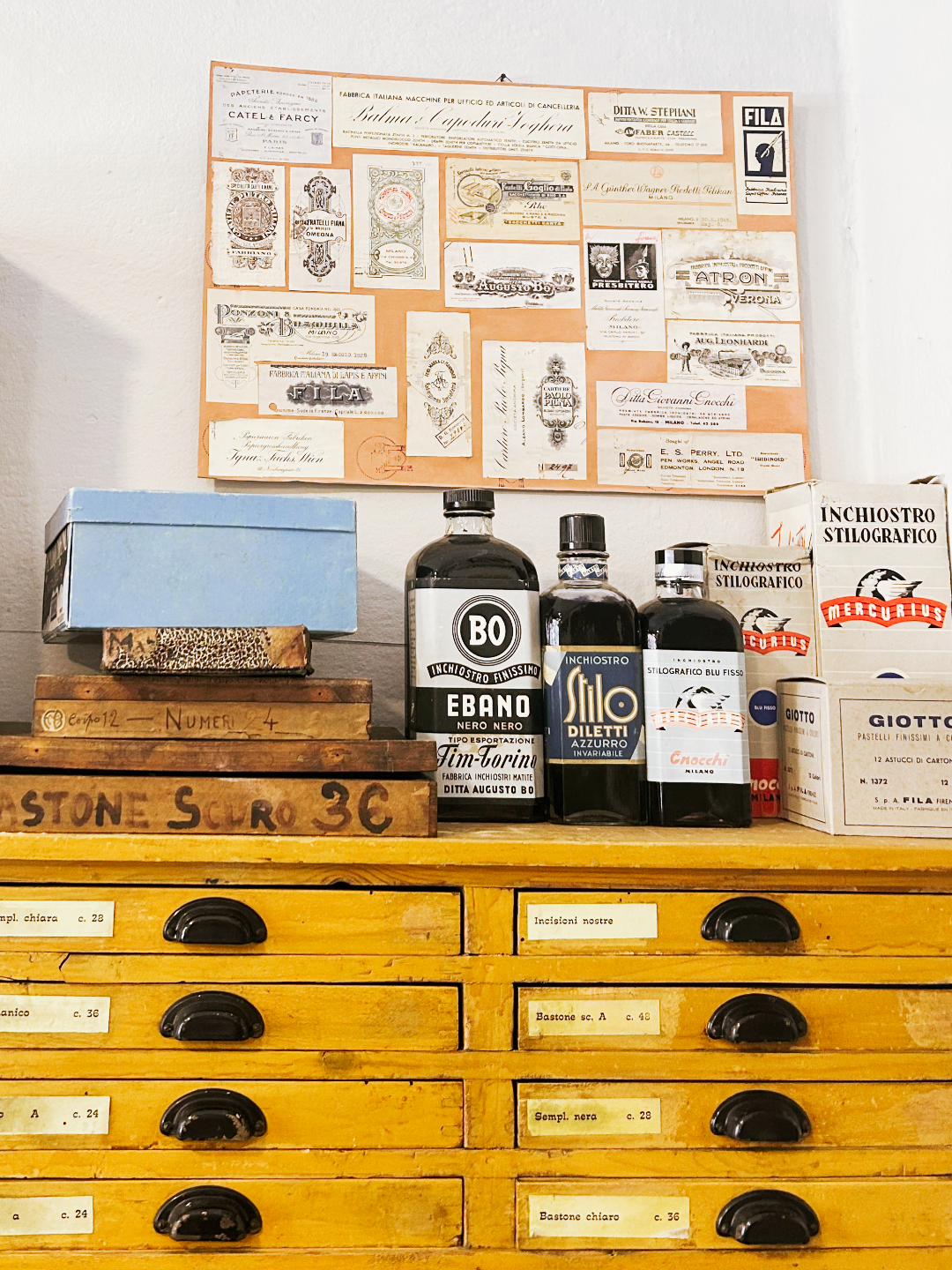
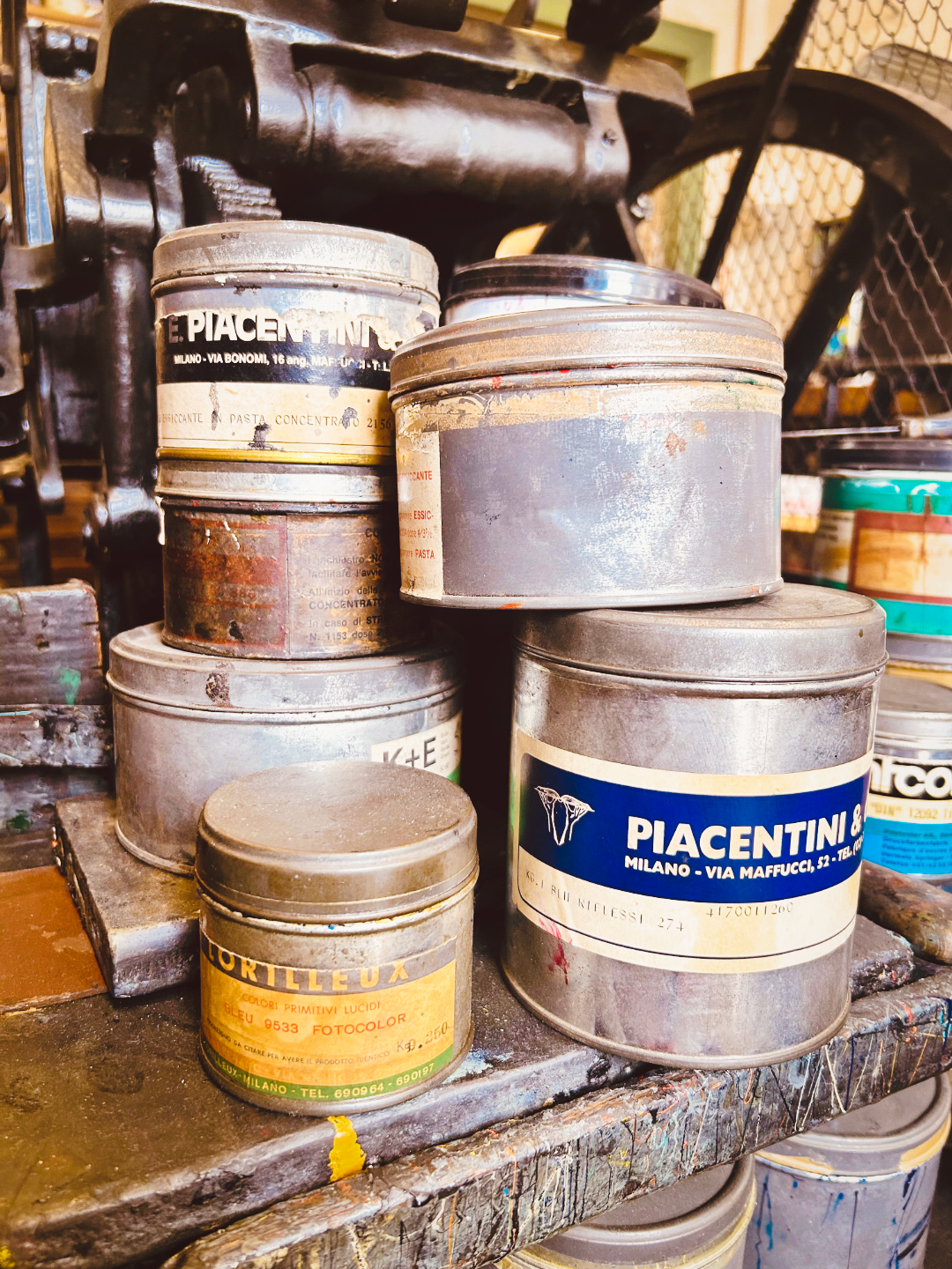
Turn to the right and through a doorway and the space opens up into a side room where the letterpress printers still run. This is where the atmosphere thickens. Working Heidelberg platen presses sit alongside older machines, their cast iron forms blackened with generations of ink. Banks of wooden type drawers line the walls, each labelled in faded typescript: Sempl. chiara, Romanico, Bastone scuro, Numeri scuri. Tin pots of letterpress ink are stacked beside the machines, their labels — Piacentini, Cortilleux Fotocolor, BO Ebano Nero Nero — reading like a mid-century poem. Prints, magazines and journals are for sale. Oversized pencil sculptures in red, yellow, pink and green stand in a corner, absurdist and somehow completely appropriate. Curios and props catch the eye from unexpected angles.
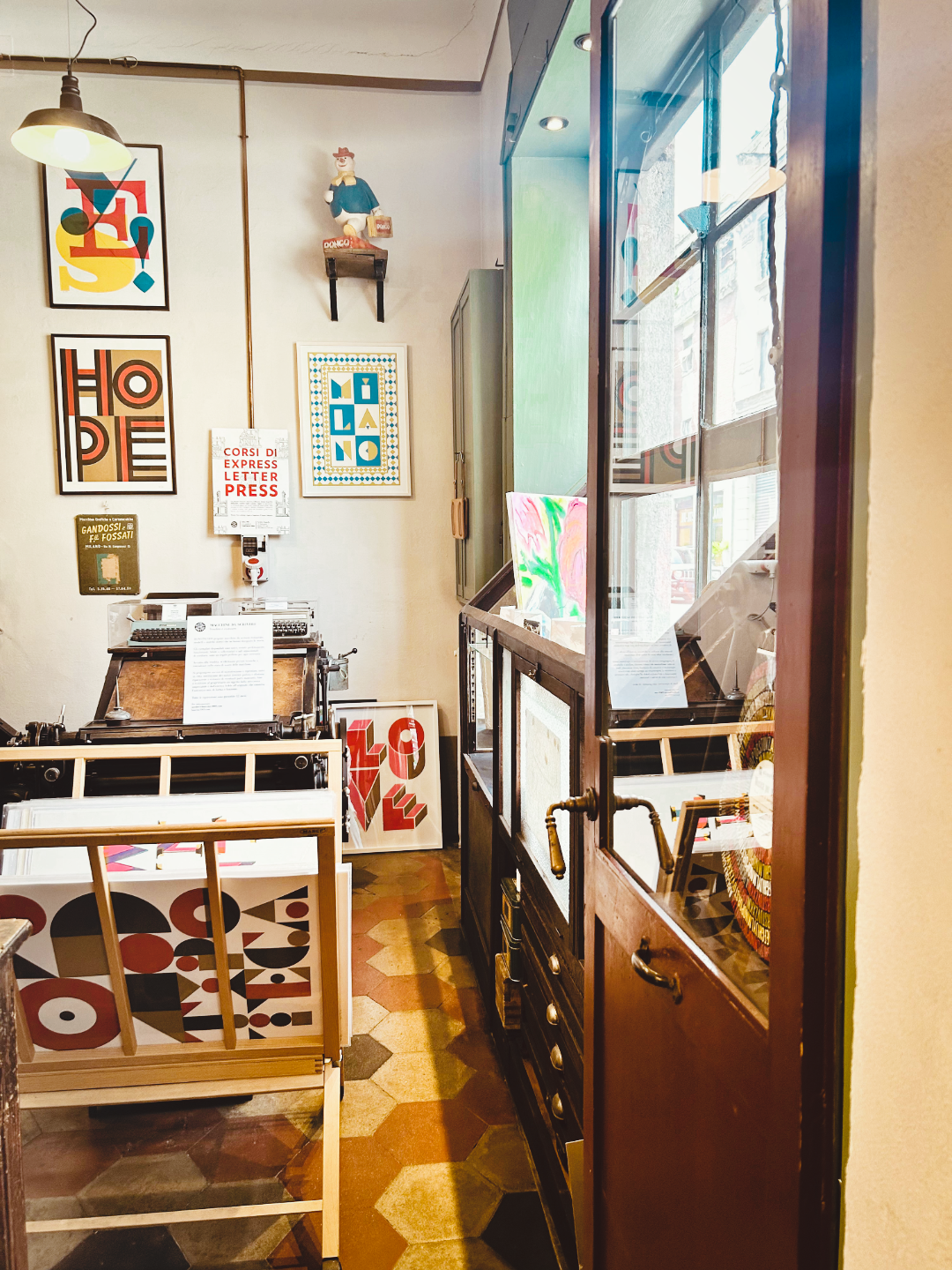
High on a shelf above the room, perched on a wrought-iron bracket, sits a Dongo figure — a plump, cheerful vintage Italian character in a blue jacket and red hat, carrying a small suitcase and a sign bearing his name. He has the air of someone who arrived long ago, found the place to his liking, and decided to stay. He watches those who pass beneath him with the knowing calm of someone who has seen a great many things come and go.
An Olivetti Lettera 32 sits showcased near the entrance — the iconic Italian typewriter, designed in 1963, all smooth curves and sage-green keys. It is immaculate. We stood in front of it for longer than was strictly necessary, mentally calculating the dimensions of our hand luggage. The maths did not work out in its favour. We left it behind. We are still thinking about it.
The third room — signed with a hand-painted BoardStore / Libreria arrow — is a bookshop occupying what was once the bindery warehouse. Its shelves carry a curated selection of titles on typography, illustration, graphic arts, calligraphy, architecture and writing. This is the kind of place you could lose an afternoon to without any particular sense of regret.
This is the kind of place you could lose an afternoon to without any particular sense of regret.

<07>

<08>
A DIFFERENT KIND OF QUIET
What strikes you most about Fratelli Bonvini is not any single object or room but the quality of the atmosphere. The whole place moves slowly. There is no music. There is no urgency. The staff — genuinely passionate about the space and its contents — move with the unhurried ease of people who understand that the point is not to sell you something quickly and move you on, but to let the place do what it has always done: draw people in, slow them down, and remind them of things they may have forgotten.
There is the smell of ink and old wood. There is the particular stillness of a space that has decided, very deliberately, not to hurry. Outside, Milan goes about its business — the traffic, the fashion crowd, the aperitivo hour building on the horizon. In here, the relevant unit of time is the century.
Alongside the Heidelberg presses and the type drawers, Bonvini also runs workshops — in letterpress, calligraphy, bookbinding and typography — for anyone who wants to do more than look. A poster on the wall advertised Corsi di Express Letter Press. The machines, in other words, are not decorative. They are still being learned.
WHY IT MATTERS
We spend a great deal of our professional lives thinking about how artistry is expressed and communicated — how the work of makers, designers and creative people finds the audiences it deserves. Places like Fratelli Bonvini are a reminder of how much that artistry can be contained in the physical: in a drawer full of moveable type, in the weight of an ink-stained roller, in the resistance of good paper under a well-made pen.
There is a reason people are returning to handwriting, to letterpress, to the analogue. It is not nostalgia for its own sake. It is the recognition that some forms of making carry something that faster, easier alternatives cannot replicate: the evidence of a human hand, moving at human speed, leaving a mark that cannot be undone.
Fratelli Bonvini has been providing that since 1909. Long may it continue.
FRATELLI BONVINI (BONVINI 1909)
Via Tagliamento 1, 20139 Milan, Italy
Tuesday–Saturday: 10:30–13:00 and 14:00–19:30
INSTAGRAM: @bonvini1909
<01> Exterior of Fratelli Bonvini (Cartoleria / Tipografia shopfront)
<02> Open book/journal with handwritten Italian names and notes
<03> Fratelli Bonvini in-store shelving unit stocked with stationery
<04> Front room overhead shot showing the diamond-tiled floor and stationery displays
<05> Side room interior of Fratelli Bonvini printroom
<06> Dongo promotional mascot figurine on shelf, Olivetti typewriter, HOPE print and letterpress prints
<07> tacked vintage ink tins (Piacentini etc.) beside the press
<08> Wooden type drawers with the angled lamp / the full workshop room with Heidelberg press and BookStore sign
Contact
Say hello:
General Enquiries & New Business: hello@tyde.agency

EXPRESSING ARTISTRY OF ALL KINDS.